(Get free painting tips and plein air painting techniques sent straight to your inbox or on my social media.)
Shape in art is a fundamental concept and is the key to all great master paintings. In this chapter I will talk about some of the most important design principles for good shape design and give you some practical tips for how go about improving the design of your shapes.
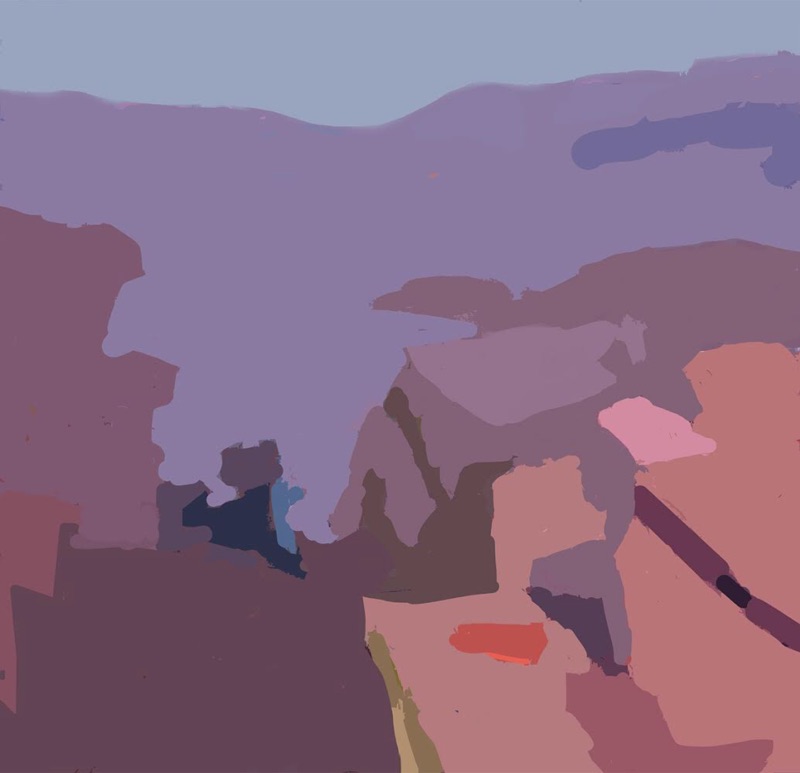
Shape in art is a flat two-dimensional area of color that has an identifiable edge or outline. The essence of creating Visual Music in a painting is to design interesting shapes that intrigue and captivate the viewer. This is the key to master paintings. You can think of a painting as simply a two dimensional surface built from a series of shapes and combined into a mosaic-like structure. In this structure, all the shapes fit together to cover the surface of the painting. There are several principles you can follow to create good shape design in your paintings. Here are some of them.
Tip #1: Editing Nature
The visual appearance of nature is complicated and consists of a myriad of shapes. Together these shapes represent real things. However if you were to look at those shapes without knowing what the subject was, the inherent shape design of nature is often uninteresting.
The easiest way to see this is to turn a photograph upside down. When you don’t know what the subject is, the end result, viewed as a graphic image with no meaning, is often not very interesting at all. This means that if you want your work to have Visual Music, you need to edit the shapes we see in nature and redesign them from an artistic point of view. Generally this will also mean you will have to simplify the shapes.
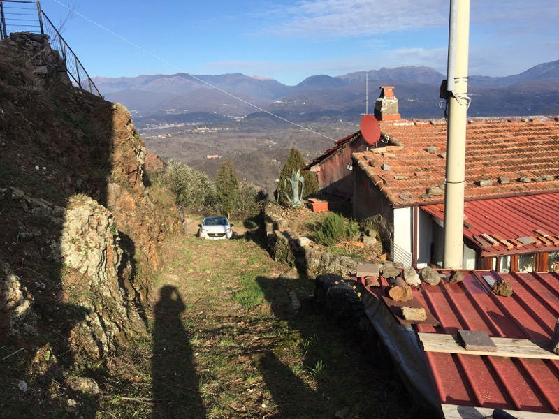
There are two ways of doing this. You can do one or the other, or do a combination of both methods. You can:
- crop the scene in order to make the shapes more interesting, or
- redesign the shapes themselves
Cropping the scene is the simplest method, and allows you to get creative with your design by varying both the aspect ratio of the crop (the proportions of the height to width of the rectangle you use to crop the scene), or to zoom in or out of the scene. However you are still limited by the scene in front of you.
Redesigning the shapes gives you more flexibility in your design. However it is more difficult because when you redesign the shapes you have to make sure that you do not lose the essential characteristics of the specific things you are painting.
For example, if you are painting mountains in a particular area, there is a specific pattern in the way the valleys and peaks of those mountains in those area are formed. That pattern is not completely random. If you do not respect that pattern, your mountains will look as if they belong in a different place, and you will lose the poetry of that specific landscape.
I generally use a combination of these two methods.
Tip #2: Cropping A Scene – Negative Shapes And Spaces


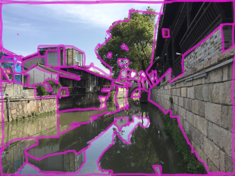
This is a photograph of a village scene that I painted in China. But if you painted the scene just as it appears in the photograph, the shapes would not be very interesting.
So in order to find more interesting shapes, I tried different ways of framing, or cropping, the image. For example, here are three ways of cropping the image.
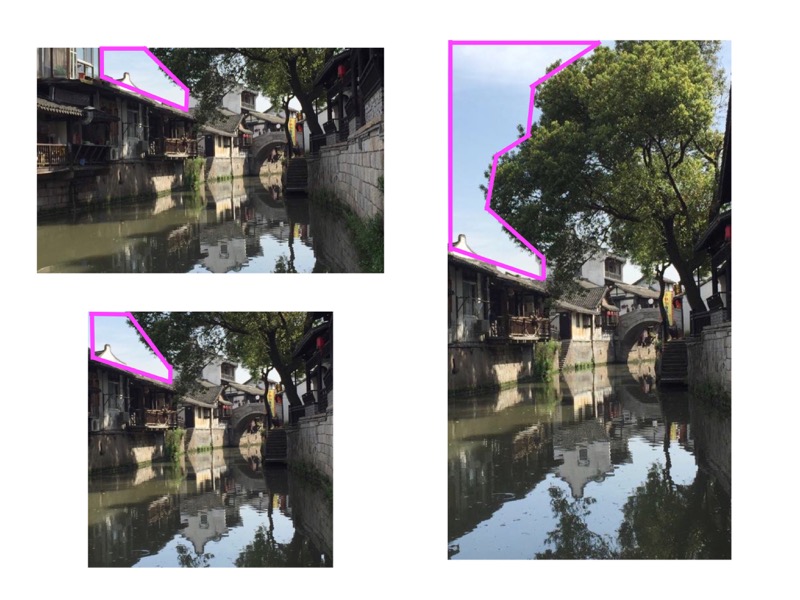
An important thing to note is when you crop a scene, you create a shape between objects in the photograph and the boundary of the image. These shapes are called negative shapes or negative spaces.
By cropping the scene in different ways you can make these negative shapes more interesting. Here you can see that just by cropping in a different way, the shape formed by the top of the buildings and the sky is completely changed.
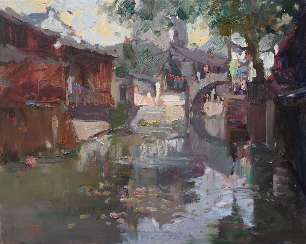
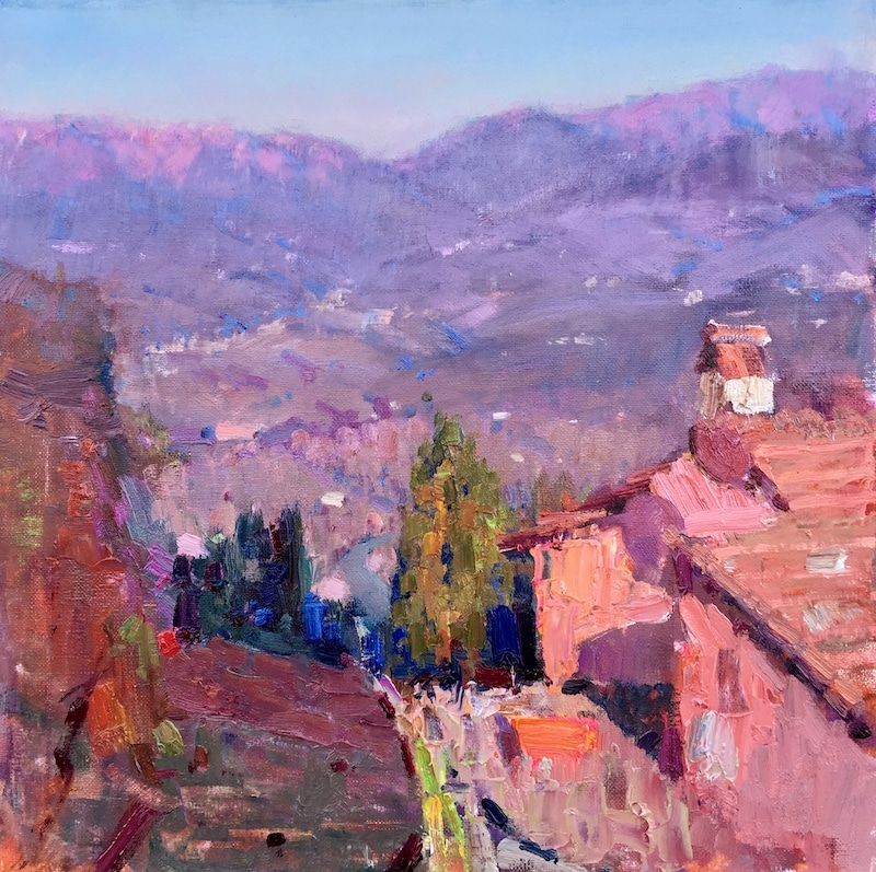
Here is a painting I did in Xinchang in China. Let us take a look at how this painting is divided into shapes.
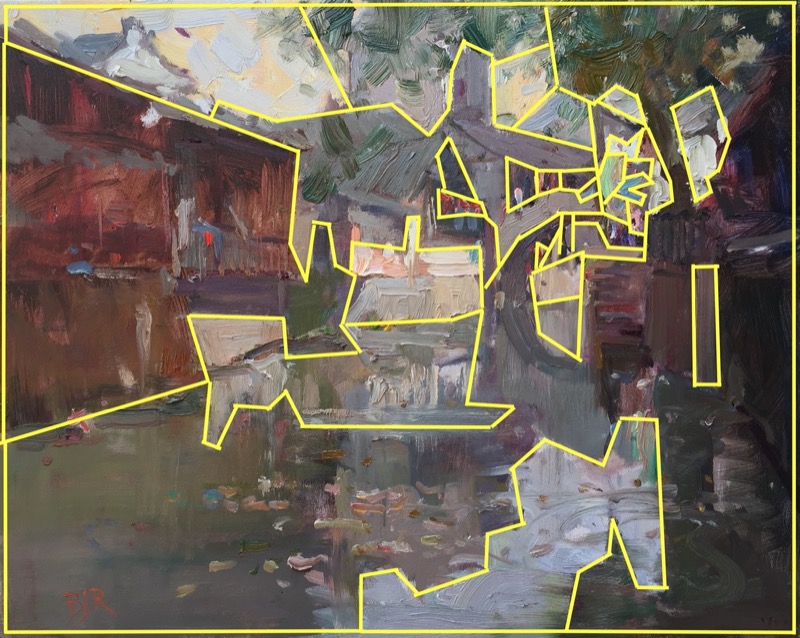
These are the major shapes in the painting. Each shape is differentiated from the others by having a different value or saturation. Within one shape there may be several different warm and cool color differences, but each of these warm and cool colors has an identical value.
This arranges the colors in the painting into a pattern of shapes, with a clear level of organization. It is this organization that creates a solid foundation for the painting.
Creating an interesting painting is not copying the confusion of colors in nature, but organizing them into patterns. This is analogous to music. Creating music is the process of organizing the incredible variety of sounds in nature into a logical arrangement of sound in which the sounds have an organized relationship to each other.
In music these sounds are called notes, and they are organized into scales, harmonies, and rhythms. Painting is the same, but composed with shapes and colors instead of sounds.
Tip #3: Practical Tips – Drawing

Sometimes when I am not sure of my exact composition, I will start to draw the complete scene accurately in my sketch book. Then after I have finished the sketch I will use my pencil to select and frame different parts of it.
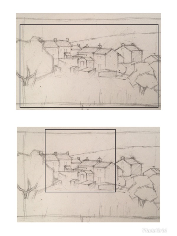
I am looking for interesting shapes and especially for interesting negative shapes. I usually try several different compositions and choose the best one.
I experiment with rectangles of different proportions, some vertical, and some horizontal, and also square shapes.
Tip #4: Principles of Shape Design
There are some principles that you can use when designing shapes to make your painting more interesting. Here are some of them.
Unequal Space Division
The most important principle to observe when designing a shape in art is to make sure you have a wide variety of different sized shapes. A painting with a variety of differently sized shapes is far more interesting than one in which the shapes are all of a similar size.

A good guide is to have three different categories of sizes of shapes, large, medium and small. I referred to these as daddy, mommy, and baby shapes. Generally you will have just one or two daddy shapes, several mommy shapes, and a large number of small shapes.
Dominant Shapes
When creating shapes you will generally need to have one dominant shape. In other words, one shape that is much bigger than all of the others. The principle of dominance is a very important in many aspects of the design of a painting and I will talk about it more in this book.
Interlocking Shapes
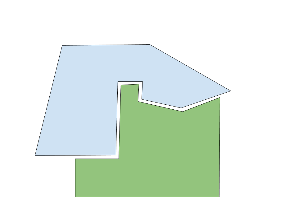
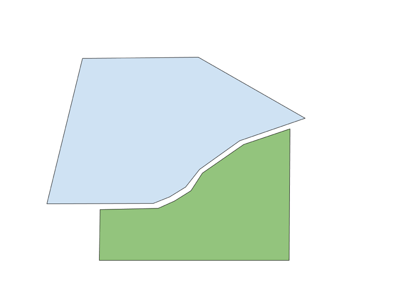
Another tip for good shape design in art is to have your shapes interlocking with each other. In this example you can see the green shape inserts itself inside blue shape. These interlocking shapes are much more interesting in a painting than shapes that are just side by side.
History Of Shape In Art
The use of shape in art has a long history in both Eastern and Western art traditions.
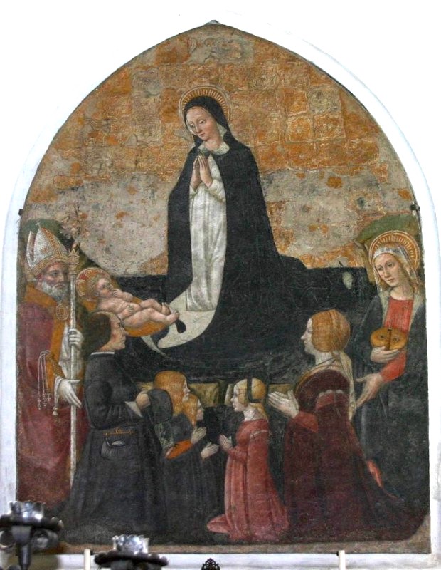
This painting done in 15th century Europe is a very early example of the organization of a subject into beautifully designed shapes. Each shape has a specific value and you can see the variety in sizes.
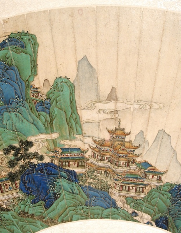
This image shows an image of a Daoist paradise created in 18th century China. Images of Daoist paradises were sometimes used for birthday gifts as it was given or used as a symbol of future success. Using the archaic blue-and-green landscape style, Xu Yang (Chinese, active ca. 1750–after 1776) painted this image on a folding fan in ink, color and gold on paper. It shows the use of simplified shapes to create an interesting pattern.
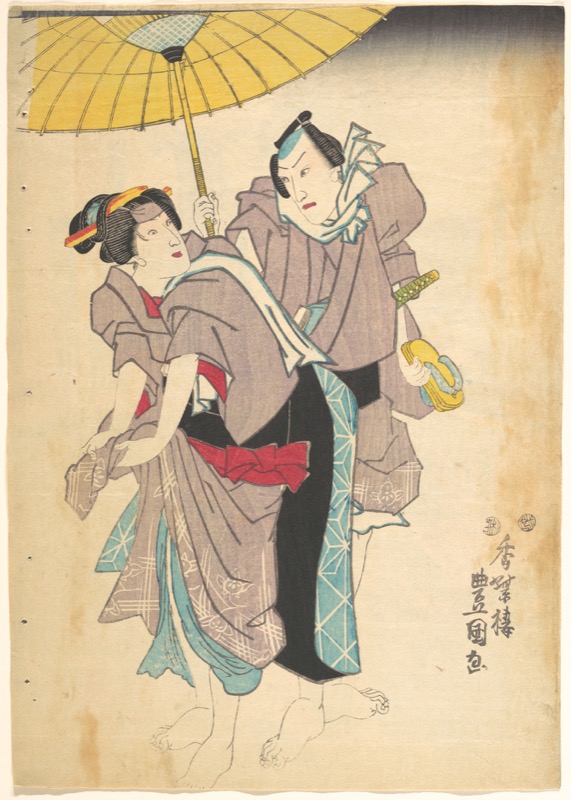
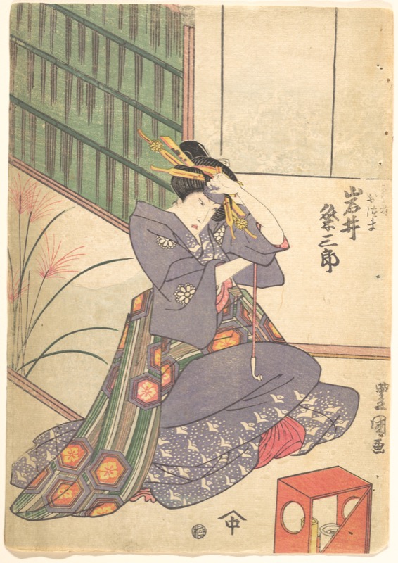
Utagawa Kunisada was the most popular, prolific and commercially successful designer of ukiyo-e woodblock prints in 19th-century Japan. In his work you can see how he organized the shapes of the figure. He made use of negative shapes created by the figures against the background, dominant shapes, and a variety in the sizes of shapes. It was the role of shape in art in these images from Asia that heavily influenced the Impressionist Movement in France and other countries in Europe and North America.
For More Information On Shape In Art
For more information on shape in art see my articles on Unequal Space Division and Interlocking Shapes.
Also see Wikipedia: List of shapes
FAQ Summary
Definition Of Shape In Art
A shape is a flat two-dimensional area of color that has an identifiable edge or outline. Artists use two kinds of shapes in art: geometric and biomorphic.
Geometric shapes are precise and regular, such as triangles, squares, rectangles, polygons, circles and ellipses. You find these shapes mostly in architecture or other human-made objects such as in vehicles and machines.
Biomorphic, or organic, shapes are found in nature. They include the shapes of trees, mountains, clouds and so on.
What Are The Five Basic Shapes In Art?
The five basic shapes in art are the geometric shapes: triangles, squares, rectangles, circles and ellipses. From these five basic shapes you can create other more complex shapes such as polygons or combinations of circles and rectangles.
What Is The Difference Between Shape And Form?
A Shape is a flat two-dimensional area of color that has an identifiable edge or outline. A Form is a three-dimensional shape, but it is often used to describe the illusion on a two-dimensional surface of a three-dimensional form. As with shapes in art, forms can be geometric or organic.
Thank You
Thank you for taking the time to read this article. I hope you find it useful. If you would like to get free painting tips by email, please sign up for my free tips newsletter.
If you are interested in a structured approach for learning how to paint, take a look at my online painting classes.
Happy painting!
Barry John Raybould
Virtual Art Academy



this art is the best art I have ever seen