Color is one of the main reasons people want to paint. However, color is a complex subject, so if you want to master it you need to simplify it, and using color pairs is one way to do that.
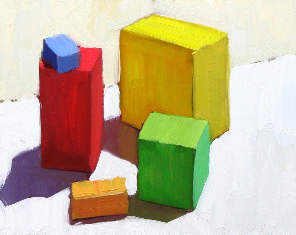
By color pairs, I mean the two colors you see when light falls partly on an object, leaving part of it in shadow. These two colors have a very fixed relationship. If you get the relationship right, these two colors create a perfect color harmony. It will also give your painting a strong feeling of light. Get it wrong though, and you will lose both of these benefits.
Get the color pair relationships precise
When objects are viewed in bright sunlight, for each local color you need to get the relationship between the light and shade colors pairs precise. The good news is that you only need to get a few of these color pair relationships correct to give your painting a true feeling of light. The bad news is that it takes a lot of work to get these color pair relationships just right – this is because there are about a million potential combinations at the very least! My key discovery was that you need to spend more time on getting these color pairs correct than on any of the other colors in the painting.
Use color pairs to quickly capture light and shade
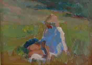
I did this small color sketch of a girl in a meadow on a small 6×8 inch pochade box, after hiking up an hour into the California hills in search of a hidden pond someone had told me about. The color study only 20 minutes and I focused on capturing just a few light/ shade color pairs: the hair, the shirt, and the legs and face. That is all that is needed to create a convincing illusion of form and to capture the feeling of the springtime light in the meadow.
Use color pairs to highlight your focal area
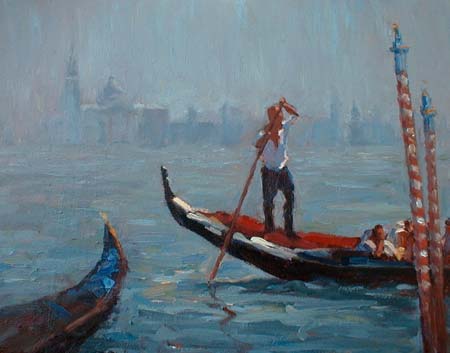
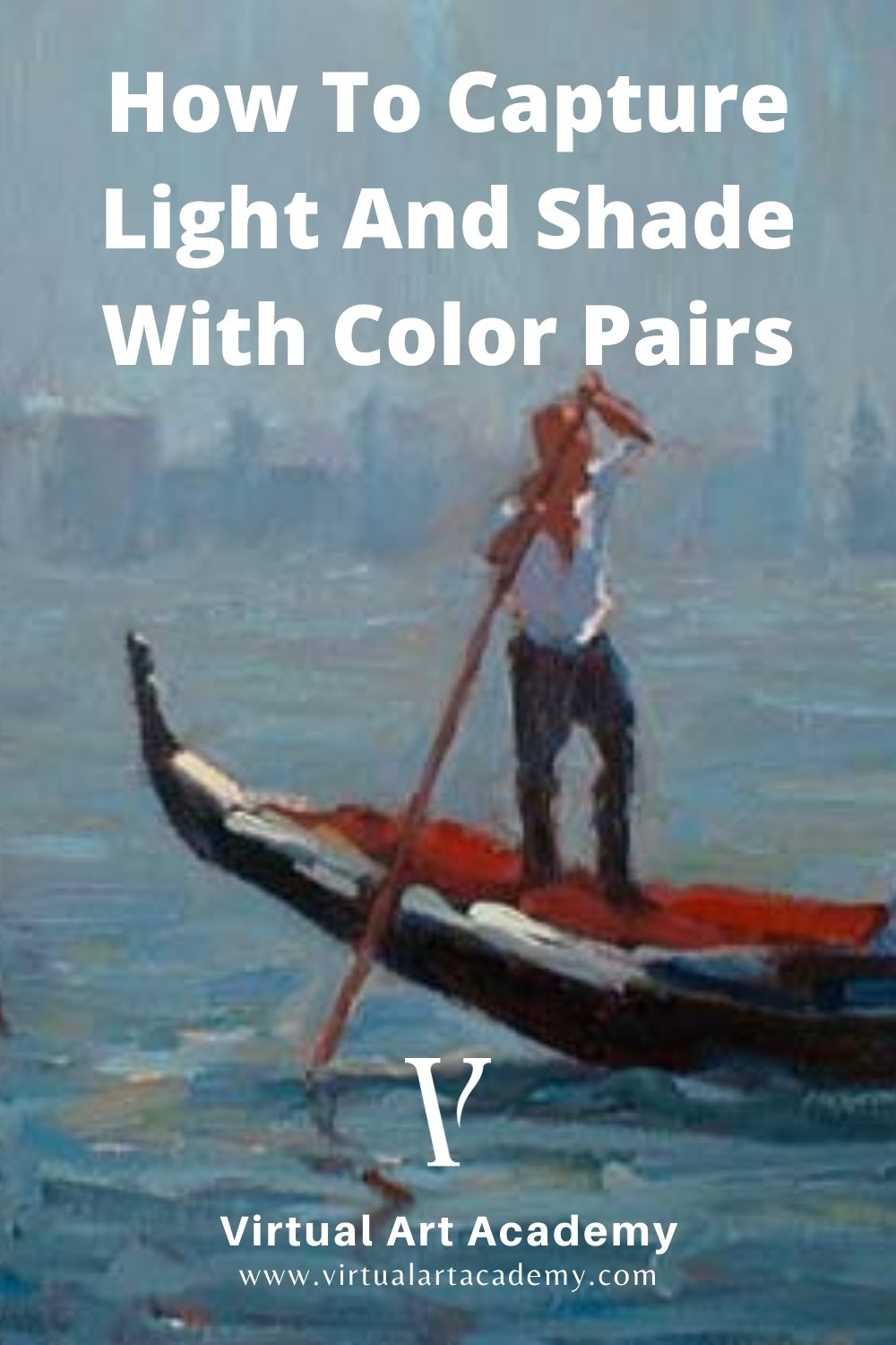
In “The Boating Trip”, to make the painting work all I needed to do was work out the two color pair relationships on the main figure and a couple more color pair relationships on the gondola to direct the viewer to the focal area. Those were the main colors in the painting. The rest of the colors were muted blue grays to give the painting an atmosphere of mystery.
Color pairs in action
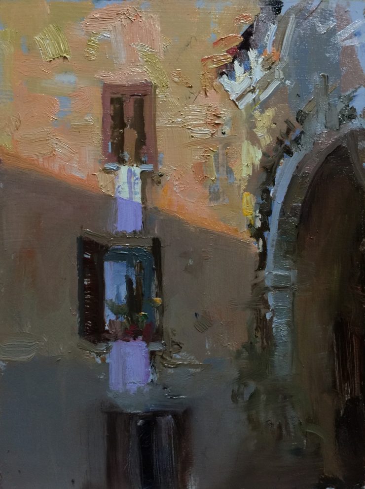
Here are some more of my paintings where I used color pairs to highlight the focal point, or create a good color harmony.
- Washing Day in Pontremoli, Tuscany
- Via Porto, Licciana Nardi, Italy
- Just Grandma and Me, Shoton Festival, Tibet
About the Virtual Art Academy lessons
Since 2003, the Virtual Art Academy has been helping artists worldwide to build and expand their painting skills. The VAA is built around a framework of nine skill Building Blocks™. The information in these Building Blocks was gathered during over 25 years of research by Barry John Raybould: reading out-of-print books written by master artists, attending workshops of artists who were taught the old master traditions, and trawling the internet for any little snippet that he could add to the extensive eLibrary and lessons.
Over the four-year course of our Apprentice Program you will learn all the key skills in every one of these nine Building Blocks.
The proof that this method works is the fact that Barry John has received many awards for his representational art, his paintings are in museums and many homes around the world, and he now has thousands of students who have gone through his online lessons and live workshops and are now achieving their own accolades.
When you join the Apprentice Program you will learn how to get accurate color pairs, one of the 192 lessons that will improve your painting skills, help you to create better compositions, and captivate your viewers.
Add comment