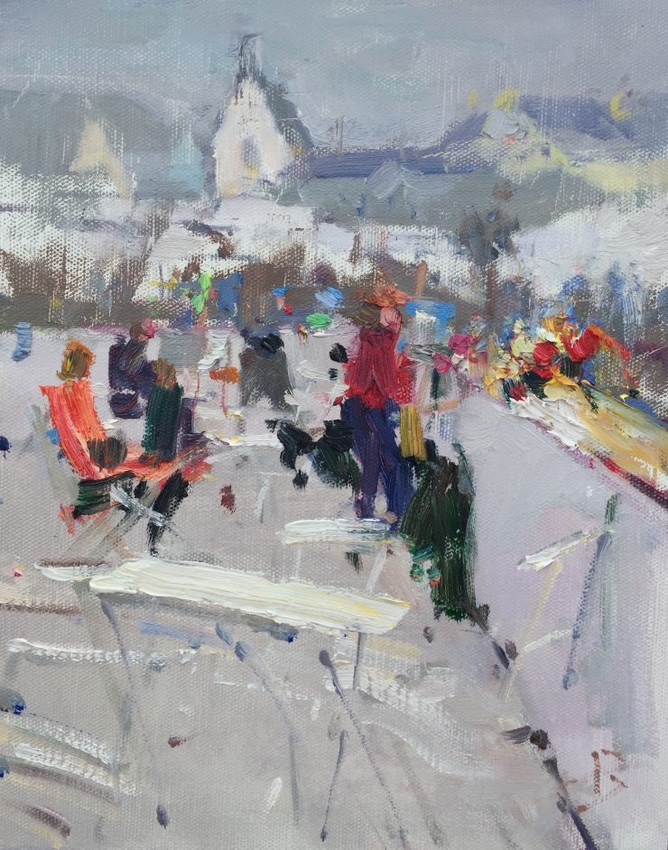
I painted Spirit of Kilmore Quay, Ireland, during a recent Art in the Open event there. At first sight the actual scene was not very interesting. Read on to see how I transformed this somewhat dull scene, into a beautiful creative design.
Availability: Sold
Photographic reference for the Spirit of Kilmore Quay painting
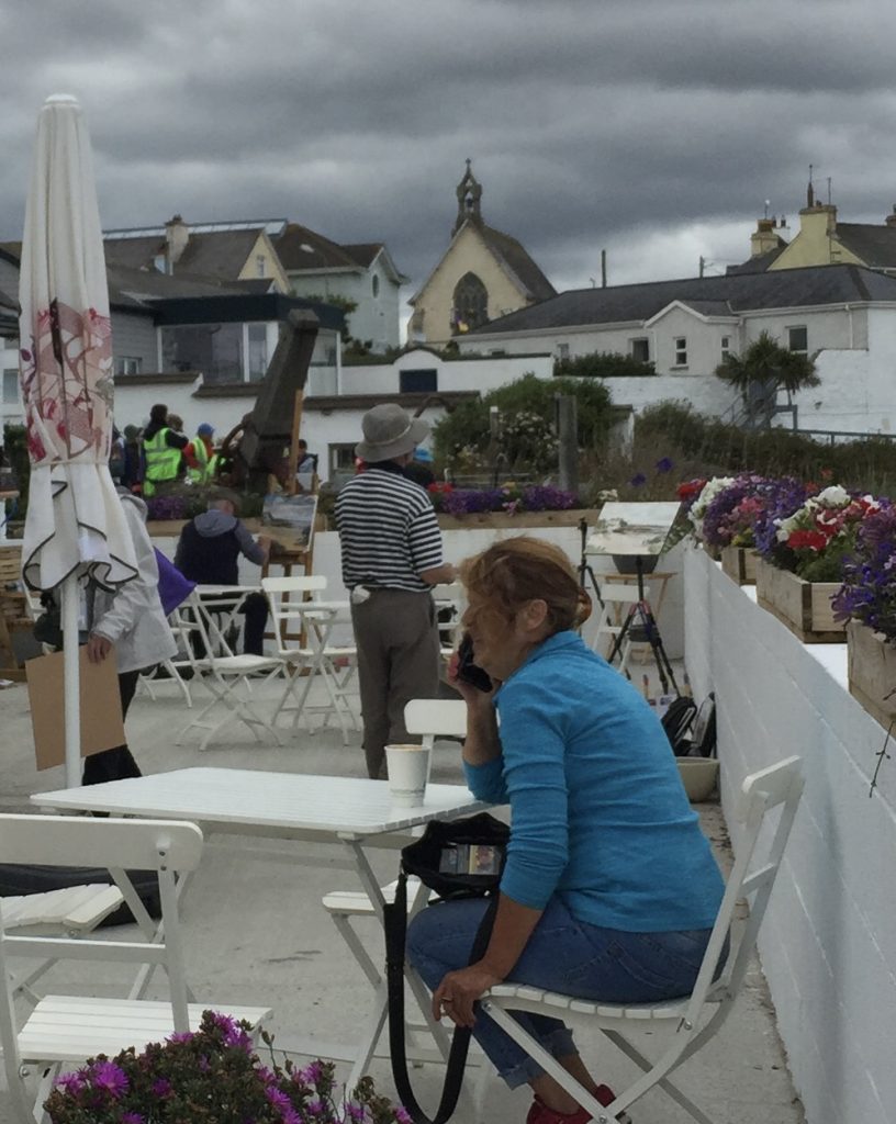
The actual scene above was very confusing. The buildings in the background had no clear shapes, and the foreground was a confusion of chairs, figures, tables and walls. There was no real clearly large shape in the design, rather there were just a lot of small disconnected shapes.
At the time at which the photograph was taken, there was not much in the way of color interest, apart from a few potted plants, and so there was not much in the way of color interest for the painting either.
However, if you look closely, you can see that the shape of the restaurant terrace is a potentially large shape in the composition, if you could remove some of the clutter.
Also, in the background, we have a very interestingly shaped silhouette in the church roof, plus a few other roofs, that echoed the angles of the church roof.
The overall scene was relatively blue gray with the sky, being cloudy and cool, the walls of the houses and terrace a cool white, as well as cool white furniture. As time progressed, when people wearing warm colored clothing moved into the scene, this provided an ideal opportunity to use that cool background as a contrast to a few warm color accents. Some potted flowers on the walls also provided a few extra color accents.
In the final painting, you can see how I took these elements and built them into a design.
So, by taking time to look carefully at the scene, and think about things like dominant shapes, contrast of temperature, interesting silhouhettes, we actually had all the elements of a successful design.
Techniques and principles used in the Spirit of Kilmore Quay painting
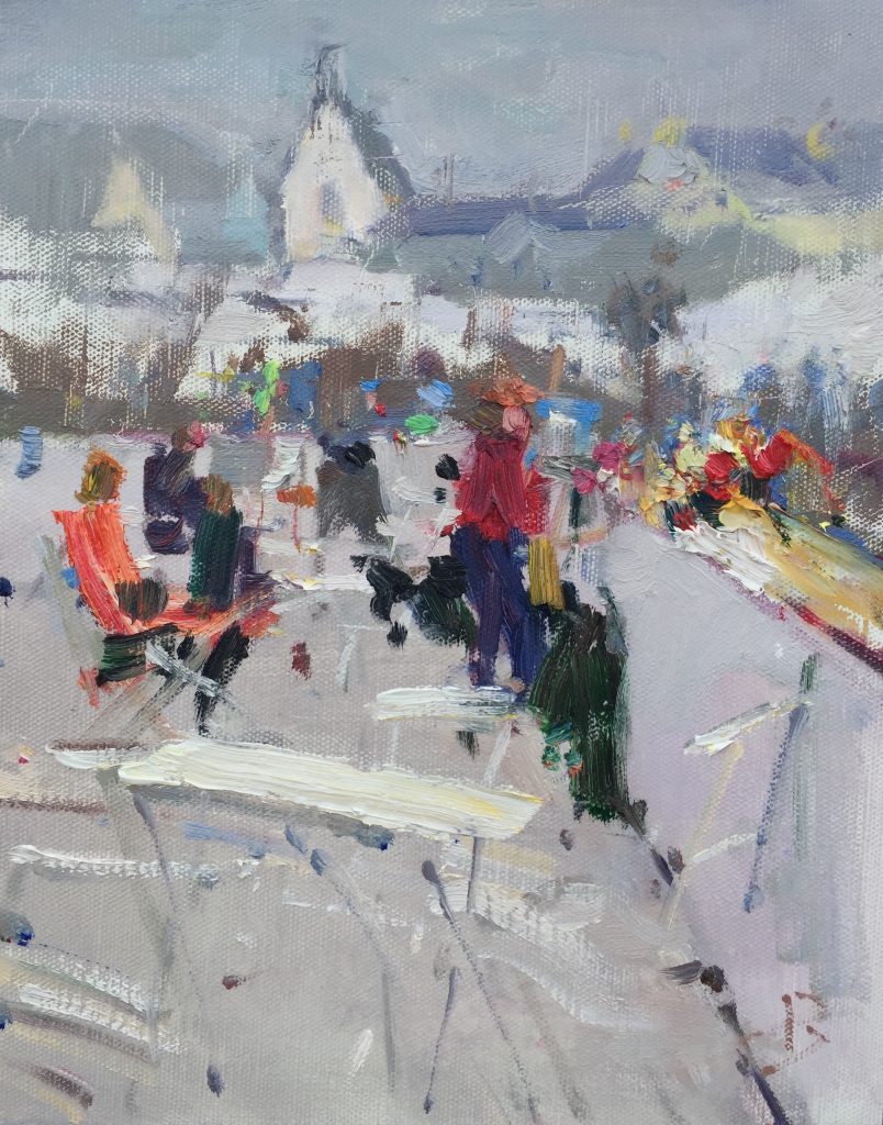
In terms of techniques, I focused on creating interesting brushwork, using a mix of thin wash-like passages, with calligraphic strokes superimposed, and large, bold, impasto strokes of paint to give a luscious quality to the paint surface. Variety of brushwork was the key to this painting.
Online painting classes
To learn more, here are the online painting classes in the Virtual Art Academy® Apprentice Program that teach the techniques I used in this painting:
- B07 How To Make Grays
- E03 Contour Notan
- F05 Brushwork Variety
- F06 Thick & Thin
- G12 Description of Texture
- H06 Contrast of Warm/Cool
- H07 Contrast of Brushwork
- L09 Hard & Soft Edges
- M06 Brushwork Techniques
- N07 Lost & Found Edges
Thank You
Thank you for taking the time to read this article. I hope you find it useful. If you would like to get free painting tips by email, please sign up for my free tips newsletter.
If you are interested in a structured approach for learning how to paint, take a look at my online painting classes.
Happy painting!
Barry John Raybould
Virtual Art Academy
What The Students Are Saying
It is a real course that trains you in a structured way

Read more “It is a real course that trains you in a structured way”
No need to buy expensive art books…. Just do the VAA 4 year course. I still refer to it

Read more “No need to buy expensive art books…. Just do the VAA 4 year course. I still refer to it”
The small steps are easy to do

A great learning platform

The course is for beginners, intermediate and advanced artists

Read more “The course is for beginners, intermediate and advanced artists”
What I learned from 10 years with VAA
It does mean you have to look at things differently in the beginning but it is really exciting to learn a new, simpler way of painting- its all about VALUES!!!
It all seems a bit strange, making Notans, outline studies, value studies all in greys, colour maps, ie not painting a pretty picture in colour, but you must trust the experts and just do it. It’s all about being able to see the big shapes and values which takes, in my case, a long time for the brain to learn how to do. Once you see, it the lightbulb goes on and everything clicks into place.
Be patient, do the exercises, trust the process and you will get good results. I did as Barry suggested and just worked through the exercises in my sketchbook from life, I didn’t paint pictures for long time. I stayed on values studies for a very long time and found I was enjoying painting again.
It’s ok to take your time. Just keep working and try to find a routine for studying, keep at it. After a long time working like this I am now getting pictures into Art Societies in London (The Chelsea Art Society and the The Mall Galleries- RBA, NEAC and Pastel Society) selling them and even winning prizes. I’ve joined Plein Air groups in London and Surrey (which are free) met and made new friends and am part of a community of like-minded artists which is important to me and makes me happy.
Georgie Rey
https://www.artmajeur.com/georgina-rey
I’m Richard Robinson …. best online art training available on the internet today

In my opinion Barry has created the best online art training available. I found the Virtual Art Academy course of painting lessons many years ago and was so inspired by it that I contacted the author and got to know him personally.
Two Critical Keys
If you are looking (like I did) for the best painting course available there are two key things you should know about the Virtual Art Academy course which make it stand out above the other online painting courses available today:
1. It’s Comprehensive.
It covers ALL the key painting concepts and then goes further, revealing more and more painting insights. Most courses miss a LOT out – this one doesn’t.
2. It’s easy to understand.
All that information could easily become confusing, but each piece is laid out clearly and concisely using Information Mapping® making it a pleasure to learn.
If you can find another painting course which does these 2 things better, please let me know. As I said, I have been searching for many years and continue to do so, so you could save yourself a lot of precious time and money by joining the Virtual Art Academy today.
Read more “I’m Richard Robinson …. best online art training available on the internet today”
I started learning oil painting with VAA from scratch. Just one year later my paintings started to sell

The most comprehensive art instruction I could find anywhere online, and trust me, I had been looking for a long time.

The Virtual Art Academy is simply the most comprehensive art instruction I could find anywhere online, and trust me, I had been looking for a long time.
Even art schools and academies I’ve been exposed to are nowhere near as thorough, VAA is just amazing!
Most paintings I see where the artist clearly has some skill still lack in either the values or notan department, or fall down on composition – it’s baffling that VAA seems to be the only program that goes into detail on this. Therefore, if you are new to painting or an experienced artist, studying with VAA will get you to that next step.
I also find that Barry is always interested in what we students do and is at hand with great advice. Worth every penny, Thank you Barry!!
Only online learning program I have ever discovered using a training industry best practice
VAA is the only online learning program I have ever discovered using a training industry best practice of incorporating Knowledge and Skills to support learning a new activity. Every building block (Drawing, Form, Observation, Concept, Notan, Composition, Colour, Brushwork) incorporates a “spiral learning” approach where you are introduced to the Knowledge/Skill at one level and then reintroduced to it again elsewhere in the curriculum. Sure genius.
I’ve attended workshops, read books, and watched YouTube videos — and none of them provide the scaffolded approach to learning the VAA offers. If you are just starting your painting journey, start here. If you are a mid level or advanced painter, start here. There is a sense of community with artists around the globe. You are part of a peer to peer learning process bigger than yourself.
As a result of the VAA, I have been juried into several shows, am represented by a local gallery and have been selling my paintings on a consistent basis. VAA curriculum’s approach will grow your ‘artist’s brush’ and aid you in finding your artistic voice. As your basics improve, your art improves. Henry Hensche said, “There is study and there is performance, and we should not confuse the two, study is done for perceptual development, our performances show us where we are in that development, and we must have both…”. VAA curriculum offers both.
I went through the entire curriculum, did every every exercise, and today review my printed books/exercises on an annual basis to keep myself fresh and ready for my next painting adventure.
Onwards/Sideways,
Jay “jbird” Holobach
https://www.jayholobach.com/
‘Ladder of Learning’ adds to overall positive experience of this awesome course

Read more “‘Ladder of Learning’ adds to overall positive experience of this awesome course”
comprehensive art education

It is impossible to fail or gain little through extensive 4 year study at VAA!
Read more “It is impossible to fail or gain little through extensive 4 year study at VAA!”
The sky’s the limit

This is a far more superior school than anything I have seen being taught at colleges across the country

The equivalent of a 4 year art education at a fraction of the cost

Read more “The equivalent of a 4 year art education at a fraction of the cost”
Building blocks of learning is the best I have seen

Read more “Building blocks of learning is the best I have seen”
An excellent foundation on so many aspects of painting

When I got word of the course available through Virtual Art Academy, I was very excited for the opportunity to learn what I never knew about painting. VAA has provided me an excellent foundation on so many aspects of painting. The course is organized very logically, provides great examples, diagrams, thorough explanations and worthwhile assignments. I highly recommend this course to anyone with a desire for an in-depth education of art.
Thank you again, Barry, I love this course Jeanne
Read more “An excellent foundation on so many aspects of painting”
The course has a steady learning curve that keeps revealing itself as you advance

Read more “The course has a steady learning curve that keeps revealing itself as you advance”
The most comprehensive, in depth and well-organized painting course available online

Read more “The most comprehensive, in depth and well-organized painting course available online”
It is wild to see how much I am learning in this course!

I retired last year, and decided I wanted to spend my time in retirement learning how to oil paint. But having never painted before, I wasn’t even sure what to look for in an online painting course. However, I did some searches for “Best Online Oil Painting Courses,” and found several references to VAA.
I signed up for VAA’s ongoing Apprentice Program last October (2023), and I am incredibly glad I did! As a beginner, I didn’t know what I didn’t know, but I didn’t have to: VAA has already mapped it all out for me. It starts out with basic, fundamental stuff, but also teaches me the THINKING that goes in the painting: the composition, my color choices, how to consciously select which darks and lights need to be emphasized, etc.
Bottomline, I am learning how to create paintings that have both visual music and poetry, and it is super fun to see my growth! I cannot recommend this course enough!
Read more “It is wild to see how much I am learning in this course!”
Barry gave me a fishing rod so I can catch my own fish

Read more “Barry gave me a fishing rod so I can catch my own fish”
Fantastic lesson plans, and a vibrant community
The Virtual Art Academy is the perfect art course I’ve been searching for. Barry’s decades of knowledge are condensed into fantastic lesson plans, creating a vibrant community. The apprentice course delves deep into drawing, painting planning, and color theory. It’s like obtaining an art degree at my own pace and more affordably. The structured format encourages interaction and feedback, enhancing the learning experience. Overall, a fulfilling way to study art from home.
The improvement in my own work reaffirms that I’ve found the right program to develop as an artist

VAA, the ultimate art course
First quality education, materials, layered learning systems, feedback loop and social support and lifelong learning – amazing
Thank you again for such an amazing program and opportunity. I wish you continued and even greater success. You have contributed to many many people… thank you from all of us.
Since I started the programme I can see improvements in my composition and use of colour

I have been working through the VAA course for over five years and would highly recommend it to anyone wanting to improve their painting. There is a huge amount of information on the site and it is well presented and regularly updated and added to. When other members have commented on work I have posted I have found it really useful. When I review my work over the time since I started the programme I can see improvements in my composition and use of colour.
Read more “Since I started the programme I can see improvements in my composition and use of colour”



Add comment