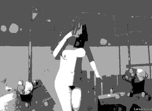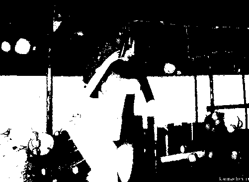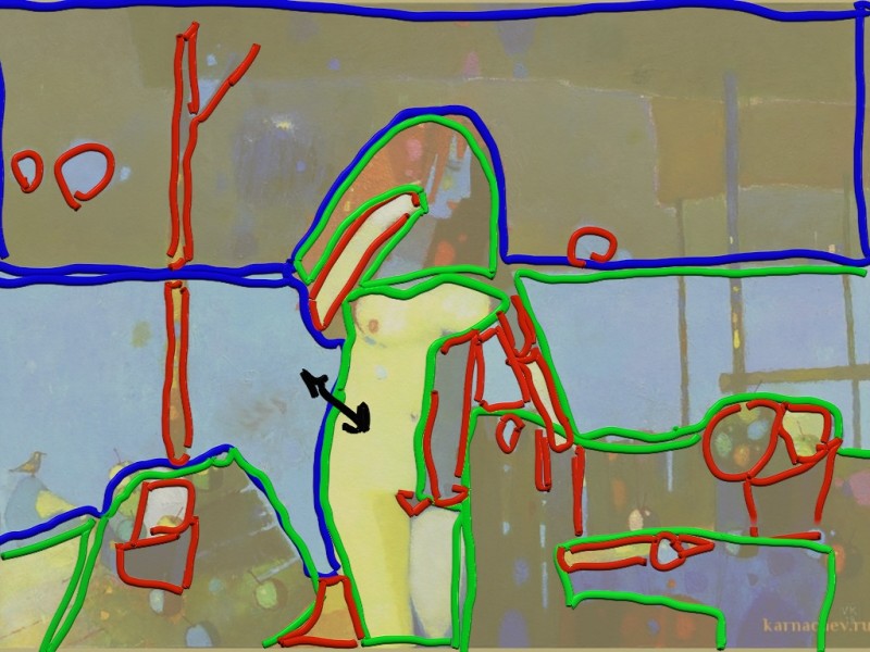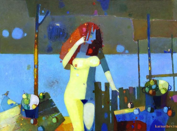
The interesting thing about this painting is the clever way Karnachev created a very simple four-value notan structure, then added detail and interest to that design using color spots of a different temperature, but identical value to one of the four values in his original notan design.

He then applied the design principles of unequal space division and point line mass.
Several of our students analyzed this painting and came out with a lot of great insights into how and why this painting works.
Kim did a great job of analyzing the notan structure:


“This painting has a strong 4 value notan. It also presents well as a 2 value notan, but the subject of the painting becomes unclear.”
Sue and Marlene gave us a lot of insights into the design and composition ideas he used, and his painting concept:
“The chosen painting has a composition that is overlaid with a grid formed by the supports for the awning. Many of the lines are rabatments of the rectangle. Within the grid are both rectilinear structures set at different angles. For example the table, giving repetition with variety and curving structures such as the curvy lady and the fruit and the bowls they are in. The shadow that crosses the figure’s neck is almost in line with the blue/brown line which is the division between the sea and, I assume the land. This emphasizes the woman’s breasts which seem to be the focal area. I find this tangent (possibly not the right term) unsettling.” Sue
“The standout feature of Vladamir Karnachev’s work for me is his strong 3-4 value notan designs and his ability to divide these values into polychromatic colour shapes of warm/cool colours whilst retaining the overall value of the shape. For instance, the fence, table and left side of the woman’s body are linked by a dark grey colour shape and within this area of the notan structure there are numerous colour spots of the same value and saturation, but different hue.” Marlene
Michal also gave us a nice summary of Karnachev’s shape design techniques:

“This painting has very good shape distinction and unequal space division. Daddy shapes in blue, mommy in green and baby shapes in red color. High density of the baby shapes in the focal area. The focal area is near the centre but it is still a very nice design because there are a lot of unequal shapes and point, line and mass in the painting.” Micheal
You can see this very interesting discussion and learn all the techniques the artist used to make this painting work if you join our painting classes.
To Learn More
To learn more about the power of Notan Design, see: A Beginner’s Guide to Notan
