(Get free painting tips and plein air painting techniques sent straight to your inbox or on my social media.)
Understanding The Three Components of Color: Hue, Value, and Saturation
Understanding hue, value, and saturation is critical for creating beautiful color harmonies. These are the basic three components of color.
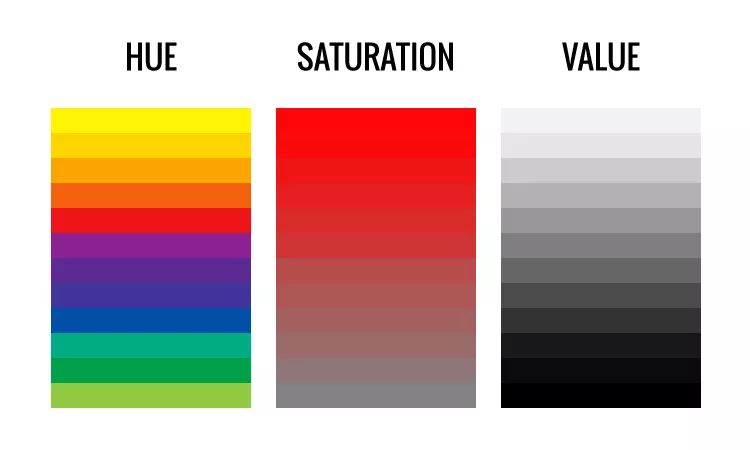
The Three Components of Color: Hue

Hue is what most people think of when using the term ‘color.’ It corresponds to its position in the spectrum. Examples of hues are: red, orange, yellow, green, blue, violet.
In scientific terms, hue is the spectral wavelength composition of a color that produces the perception of being red, yellow, blue, and so on.
The Three Components of Color: Value

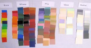
Value is the relative lightness or darkness of a color. This is what you see when you take a black and white photograph. Each tube color has a different value as shown in this chart.
The Three Components of Color: Saturation
The saturation of a color is its degree of richness, intensity, purity, or grayness. Other commonly used terms for saturation are intensity or chroma, which is technically a different attribute, but to simplify things we will treat it the same.
For example, cadmium orange is a high saturation color, and burnt sienna is a low saturation color. Both colors are the same hue (orange).
Similarly, yellow ochre is less saturated than cadmium yellow. Any given hue reaches its highest saturation at different values. Understanding saturation is an essential skill for creating an interesting color design.
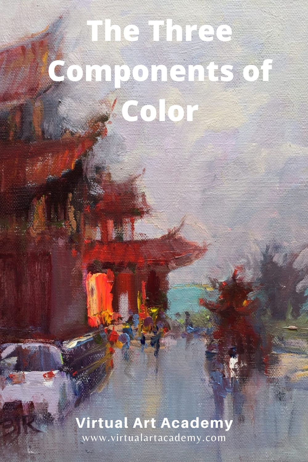
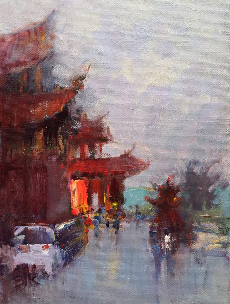
To add interest to your paintings, use a variety of saturation levels. For example in the painting above I used saturated colors in the lit part of the temple, and grayed colors in the buildings at dusk.
Munsell notation
Munsell Color Theory is based on a three-dimensional model in which each color is comprised of the three components of color: hue, value, and saturation (chroma). It was created by Professor Albert H. Munsell in the first decade of the 20th century and adopted by the United States Department of Agriculture (USDA) as the official color system for soil research in the 1930s.
The Munsell Color system is set up as a numerical scale with visually uniform steps for each of the three color attributes—in Munsell color notation, each color has a logical and visual relationship to all other colors.
The system consists of three components of color which can be represented cylindrically in three dimensions as an irregular color solid:
- hue, measured by degrees around horizontal circles
- saturation (chroma), measured radially outward from the neutral (gray) vertical axis
- value, measured vertically on the core cylinder from 0 (black) to 10 (white)
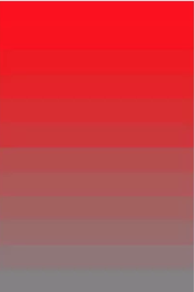
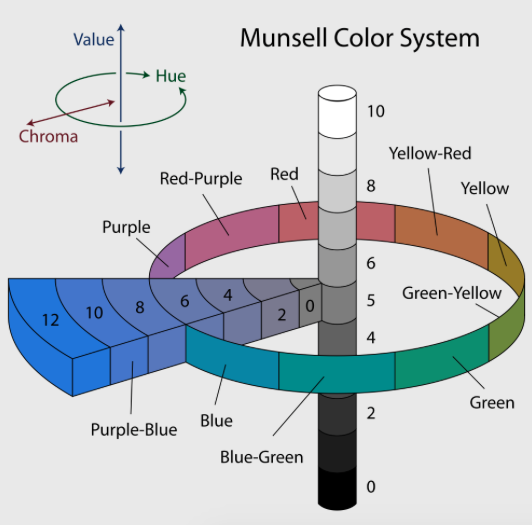
On the left, you can see how red goes from high to low saturation in art. In the Munsell system on the right, the saturation increases from the center pole moving outwards. The Munsell notation goes from 0 (neutral) to 12 for the most saturated tube colors. It is a useful way to denote color saturation in art.

The numbers on the above diagram refer to the saturation as measured by the Munsell system and notation.
The Munsell system is very useful for artists, especially when you are trying to capture atmospheric perspective. For example, in a landscape the saturation changes depending on the weather and distance from the artist:
0 = neutral overcast sky
1 = tree in light at the horizon
2 = weak sunny sky, grass at the horizon
5-6 = middle middle distance, tree in shadow
8 = strong foreground grass, tree in light
12-14 = vivid manmade clothing
14+ = fluorescent colors
See this example for how to match saturation in nature.
Key Discoveries In Practice
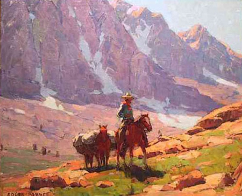
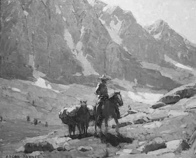
This balanced color harmony used by Edgar Payne is a good example of an artist who has controlled all three components of color: hue, value and saturation. In black and white it almost looks like a photograph.
Payne uses four levels of values: dark, dark gray, light gray, and light.
He uses three levels of saturation: high in the foreground, middle saturation in the middle distance, and weak saturation in the distance.
And he uses mainly three hues: orange, violet, and green, which form a secondary color harmony. By limiting the variations in this way he gets a harmony in the painting that you would not get if there were too many changes in these three variables.
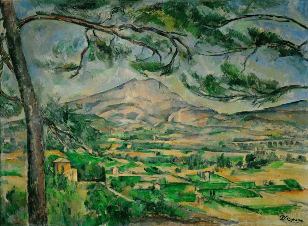
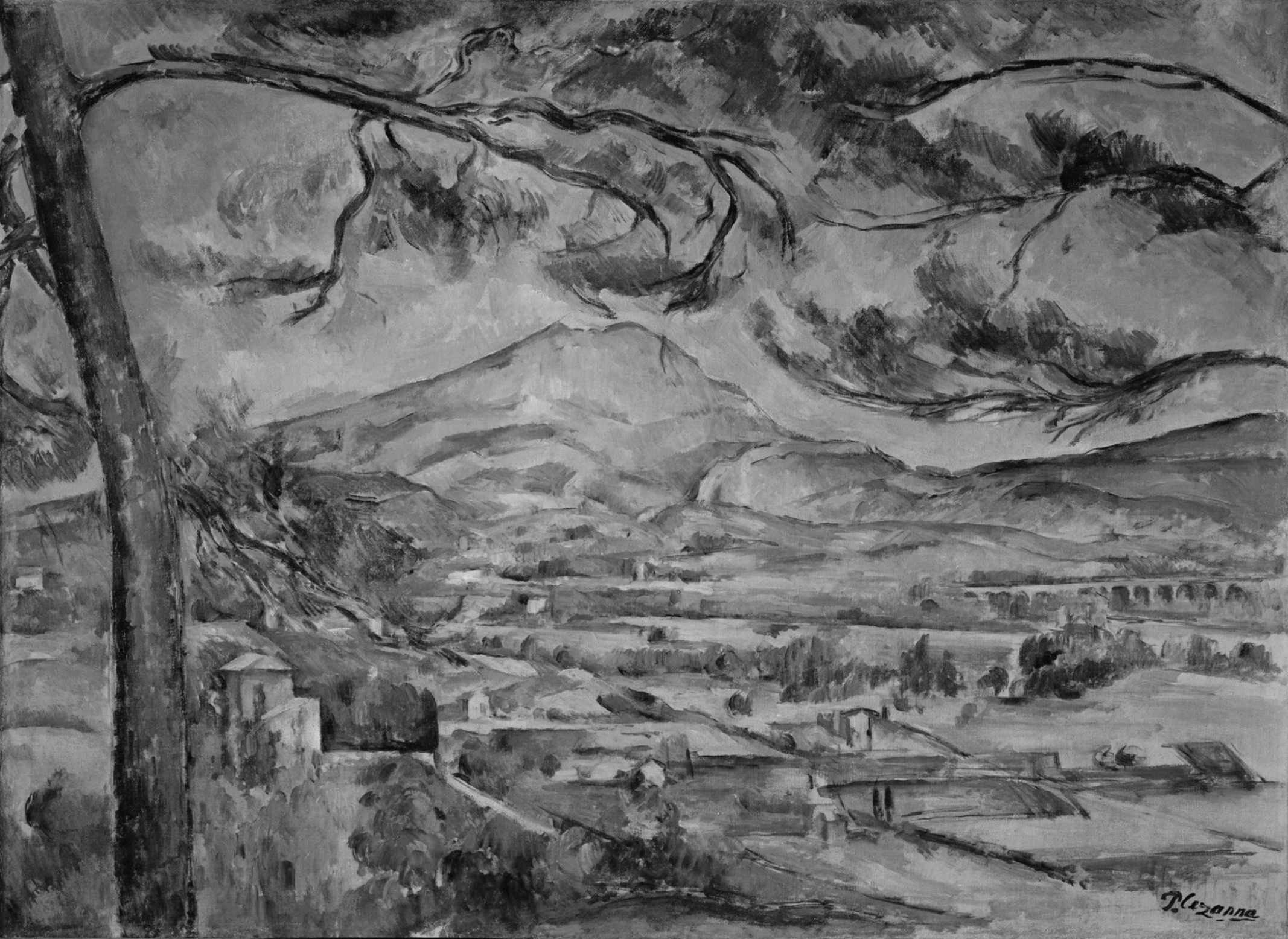
Here is another painting using secondary colors (hues) to make a beautiful painting. Again you can see higher saturation in the foreground and less saturation in the distance. Look at the black and white version and you can see how accurate the values are. If they were not accurate the composition would not look realistic.
To learn more about color
To learn more about how you can use hue, value, and saturation and the three components of color, see the Color Theory lessons in Year One of the Virtual Art Academy Apprentice Program.
Also see: Wikipedia hue, lightness, and colorfulness
Thank You
Thank you for taking the time to read this article. I hope you find it useful. If you would like to get free painting tips by email, please sign up for my free tips newsletter.
If you are interested in a structured approach for learning how to paint, take a look at my online painting classes.
Happy painting!
Barry John Raybould
Virtual Art Academy
What The Students Are Saying



This was a informative piece about color theory. it really helped one to understand the differences in hue, saturation and value.
It was great reading the artcle.
Hi Barry,
I continue to learn so much from you. The Munsell color theory is excellent in teaching about color harmony and good compositions. By breaking down the components of color to hue, value and saturation it sums up the essence of what good art should comprise of. Thanks so much for this teaching!
Your friend in Blue Hawaii,
Liz
very handy, thanks!
You have answered the main questions I have had about painting thanking you for the answers
So enlightening…