Always create unequal space divisions in your picture
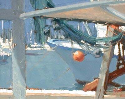
One of the most important discoveries I have made in developing a composition is to make sure you always divide the space in your picture plane unequally.
“The Nets” is a small studio painting I did from a photo I took in Corsica. I was interested in capturing the pattern of shapes created by the different tones of blue grays in the ocean, sky, and boat.
Creating unequal space division using color blocks
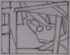
The painting is based on this patchwork of blue gray shapes. The challenge was to make sure I had a mix of large and small shapes, and to try to make all of the shapes different. You do not have to paint exactly what you see. In this painting I used a great deal of artistic license to edit the actual shapes I saw. I moved all of the beams and posts to create unequal space divisions, and omitted several of them from the original scene.
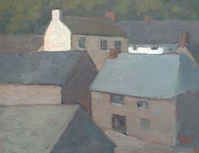
I faced the same problem in “Cadgwith Cottages” which was painted in a small village in Cornwall, England, the country where I grew up. In this case I had to carefully position my easel to get one building to obscure another and create a pattern of interesting shapes. I explored the whole village for hours from every vantage point I could find before I came across this particular spot where the buildings overlapped and created shapes of all different sizes. The painting became an exercise in making an interesting patchwork quilt of blue grays and browns.
Creating unequal space division using large and small shapes
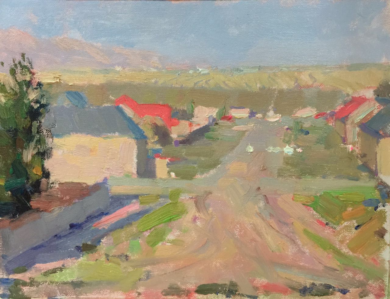
“Xinjiang Village Evening” is a small plain air painting I did during a painting expedition to the far north western corner of China near the border with Kazakhstan. This is an incredibly beautiful part of the world.
The key element that got me excited about this scene was the beautiful color harmony of the red roofs agains the warm greens of the fields and borders in the village.
The key to this painting was to find a spot where, at the right time of the day, I could find an unequal division of space in the pattern of shapes created by the different brightly colored red roofs and the warm evening glow on the houses.
I explored the whole village for a couple of days and from every vantage point and at different times of the day until I discovered this particular spot where everything fell into place for what I needed for my unequal space division composition. In the end I had to clamber up a dirt hill just above the village in order to capture this view.
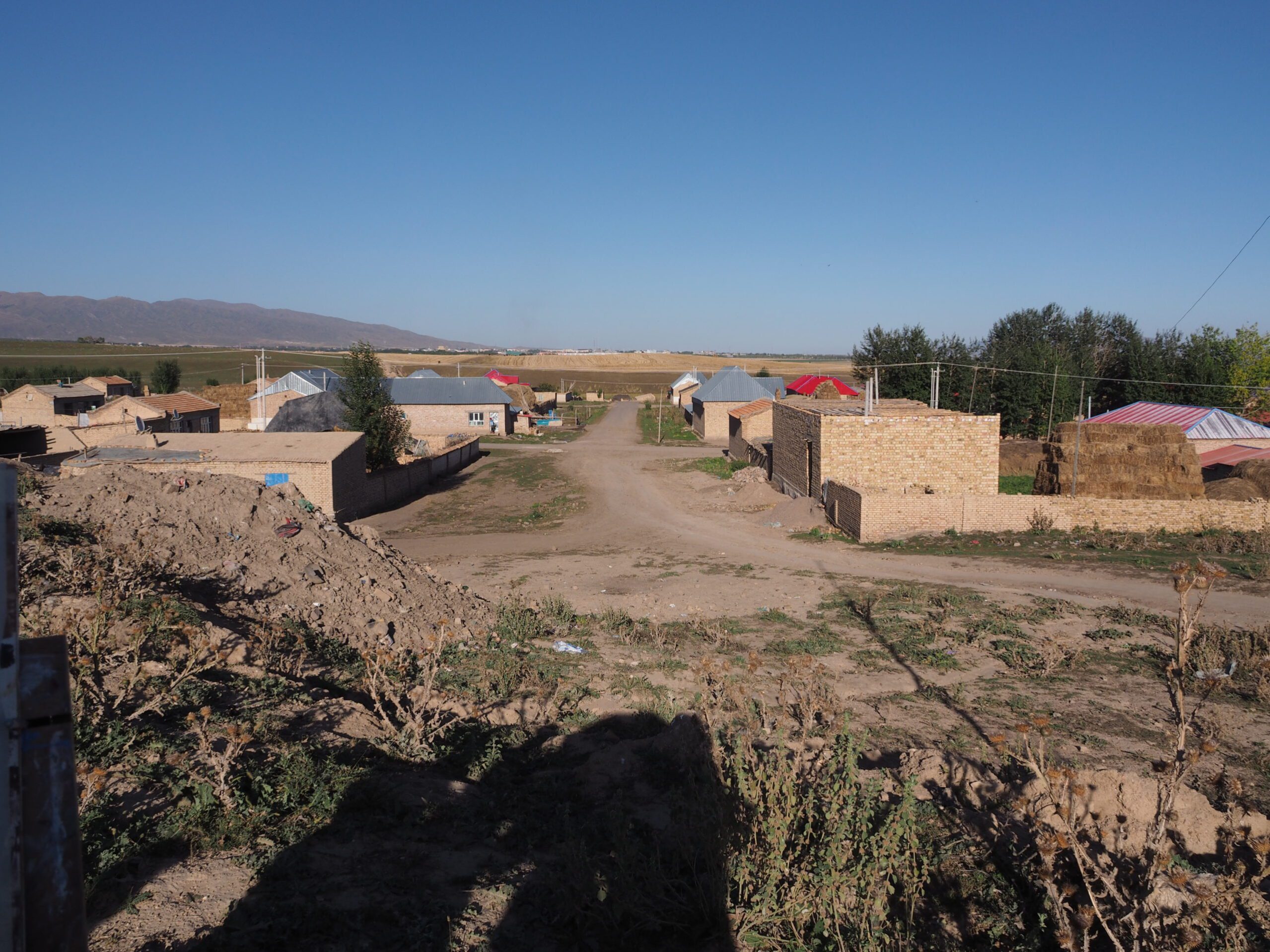
The final painting was based on this patchwork of red and warm yellow color spots. The big challenge was to make sure I had a mix of large and small shapes, and to try to make sure the shapes were distributed around the picture plane.
Planning was key for this painting — I only had 40 minutes maximum to execute the painting because that was the window of opportunity to capture this beautiful color harmony before the sun went down.
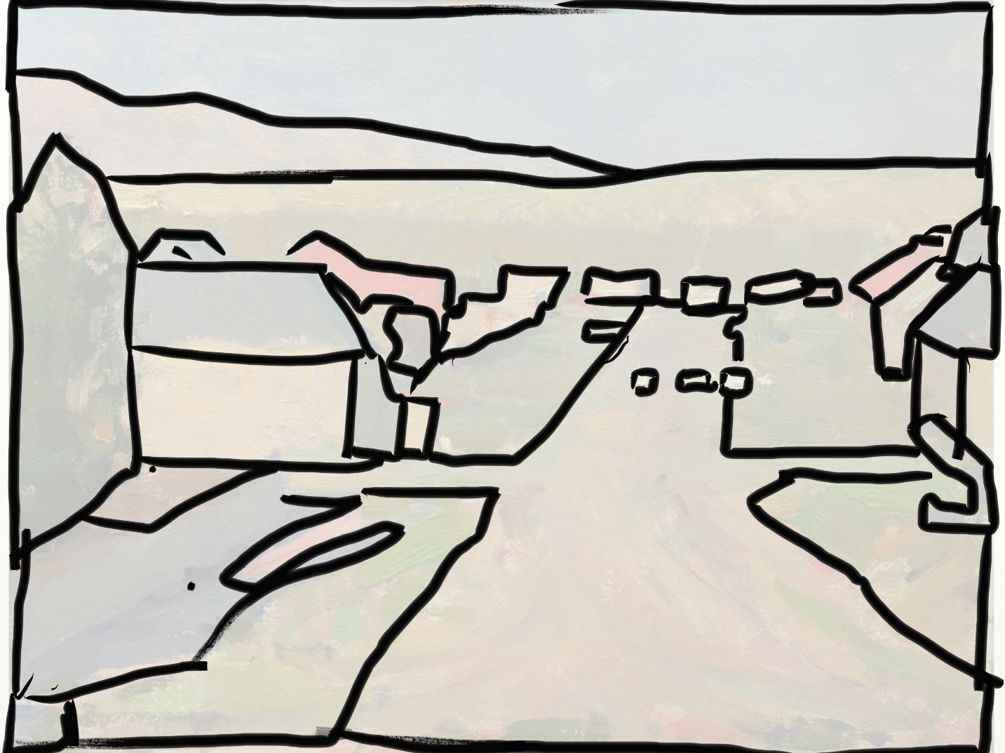
I also used the road as a unifying large shape to tie all the small shapes together. If you do not have some way of organizing your small shapes, the composition quickly falls apart and becomes disorganized.
Creating unequal space division using light and dark areas
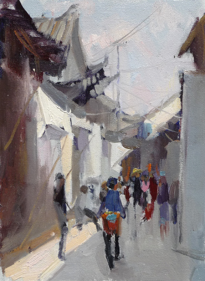
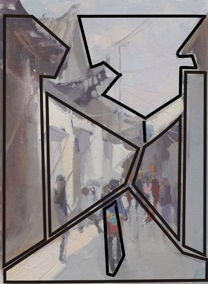
“Xizhou Main Street” is another small plein air sketch I did, this time while I was in Yunnan, China. I was interested in capturing the pattern of shadow shapes created by the buildings and the flag-like awnings that shaded the small shops. The painting is based on this patchwork of unequal space division. The challenge was to make sure I had a mix of large and small shapes, and to try to make all of the shapes different.
You do not have to paint exactly what you see. In this painting I used a great deal of artistic license to edit the actual shapes I saw, missing out a lot of the small details in order to focus on the main feeling of light and atmosphere. The figures provided a color interest to this patchwork of shapes.
In this case I had to carefully position my easel to make sure my main light and shade shapes were not equal, and at the same time find somewhere where I was not going to get run over by bicycles! I explored the whole village for a few days at different times of day before I came across this particular spot where the light and shadow shapes looked the most interesting.
Barry gave me a fishing rod so I can catch my own fish
After weeks and even months of searching YouTube, “googling” and spending a fortune on art instructional books I finally came across the Virtual Art Academy®. When it comes to purchasing online I am always very careful how I spend my money. Especially when I already spent a small fortune on art books. They always seemed great: presenting wonderful tutorials – and beautiful colorful paintings as a result. You then tend to think you will be able to create something equally beautiful after completing particular tutorial. Unfortunately not the case! I discovered that these tutorials only gave me the fish, not the fishing rod. Barry gave me a fishing rod so I can catch my own fish. The course is well planned, the lessons are clear. Simple. And I can always repeat the assignment as much as I want. And that’s what I was looking for. It opens one’s mind. It opens my eyes to all aspects of art. I see now the scene I want to paint and I think of values, preparation for the notan painting, colour. I can plan how I want to paint the scene or portrait. It’s brilliant. What I really like about Virtual Art Academy is that it takes it all apart and puts it back together. Starts from scratch, comes back to basics. It gives a fantastic foundation. It does what it says on the tin.
To learn more about design & composition
- To learn about unequal space division and how to create interesting divisions in the space in your paintings, see the lessons on Space Division in our Virtual Art Academy® Apprentice Program.
- To learn more about all the different techniques you can use to make your compositions more interesting, see the lessons on Design & Composition in our Virtual Art Academy® Apprentice Program.
- To learn much more about creating harmony and unity in a painting, see the Virtual Art Academy® Apprentice Program
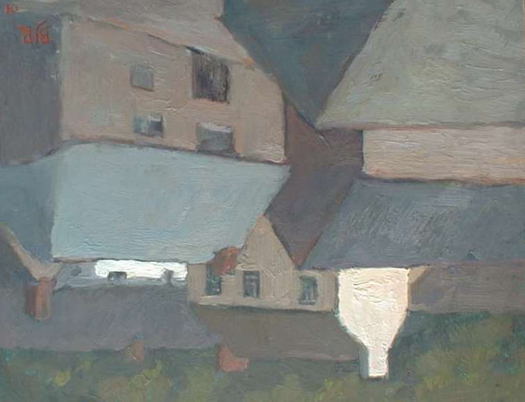
Tip: It is much easier to see your abstract division of space when you turn your painting upside down like this. Spaces that are the same size become much more obvious.
Watch this video on composition to learn more.

Bonjour
Bravo nous avons tous besoin d information comme ça.
Petit ou grand on en apprend tous les jours.
L art de la peinture est tellement vaste et compliqué que
Tous ces conseils me sont très utiles.
Merci.
Thank you, very good
This is very informative. Great to find out more about design!
Very interesting and useful. Some might incorporate this intuitively but for most of us we need this information articulated.