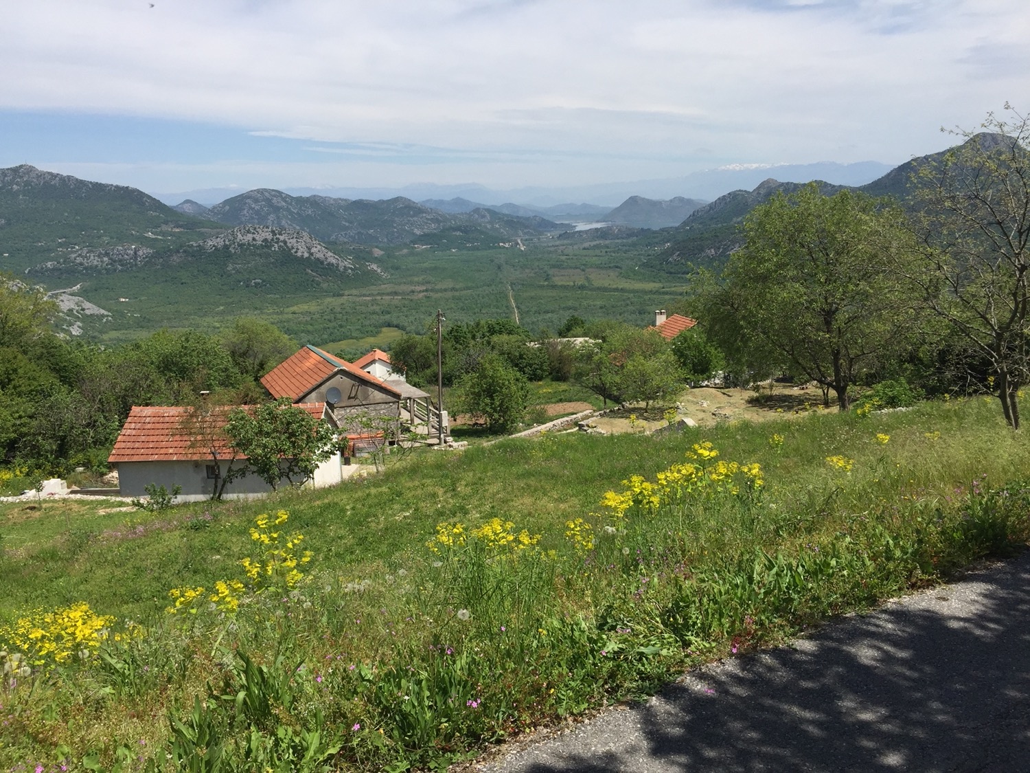
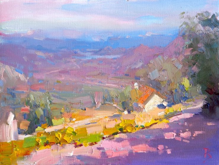
There were some great views behind Ratko’s art residence in Montenegro. I particularly loved the pastoral view in this scene looking down the valley from the coastal mountains near Bar, Montenegro, towards Skadar Lake and the distant snow covered mountains.
Working out a color harmony was not straightforward though. See this short video if you would like to know a little more about my planning behind this painting.
Photographic Reference for the painting

About the painting
A nice scene, yes. But the problem was that green, yellow, red, and blue gray do not harmonize. This meant that I had to be selective in what I used in the painting, and to exaggerate certain elements in order to create more harmony.
The basic color harmony I used was a split secondary harmony. By a split harmony, I meant take green, orange, and violet, and split each color into a warm cool version.
I paid particular attention to capturing the sense of distance using the principles of atmospheric perspective, and exaggeration.
For more information
For more detailed information on color, see my eBooks on color harmony.
Thank You
Thank you for taking the time to read this article. I hope you find it useful. If you would like to get free painting tips by email, please sign up for my free tips newsletter.
If you are interested in a structured approach for learning how to paint, take a look at my online painting classes.
Happy painting!
Barry John Raybould
Virtual Art Academy
What The Students Are Saying
It is wild to see how much I am learning in this course!

I retired last year, and decided I wanted to spend my time in retirement learning how to oil paint. But having never painted before, I wasn’t even sure what to look for in an online painting course. However, I did some searches for “Best Online Oil Painting Courses,” and found several references to VAA.
I signed up for VAA’s ongoing Apprentice Program last October (2023), and I am incredibly glad I did! As a beginner, I didn’t know what I didn’t know, but I didn’t have to: VAA has already mapped it all out for me. It starts out with basic, fundamental stuff, but also teaches me the THINKING that goes in the painting: the composition, my color choices, how to consciously select which darks and lights need to be emphasized, etc.
Bottomline, I am learning how to create paintings that have both visual music and poetry, and it is super fun to see my growth! I cannot recommend this course enough!
Read more “It is wild to see how much I am learning in this course!”
Barry gave me a fishing rod so I can catch my own fish

Read more “Barry gave me a fishing rod so I can catch my own fish”
No need to buy expensive art books…. Just do the VAA 4 year course. I still refer to it

Read more “No need to buy expensive art books…. Just do the VAA 4 year course. I still refer to it”
A great learning platform

Fantastic lesson plans, and a vibrant community
The Virtual Art Academy is the perfect art course I’ve been searching for. Barry’s decades of knowledge are condensed into fantastic lesson plans, creating a vibrant community. The apprentice course delves deep into drawing, painting planning, and color theory. It’s like obtaining an art degree at my own pace and more affordably. The structured format encourages interaction and feedback, enhancing the learning experience. Overall, a fulfilling way to study art from home.
The small steps are easy to do

The equivalent of a 4 year art education at a fraction of the cost

Read more “The equivalent of a 4 year art education at a fraction of the cost”
An excellent foundation on so many aspects of painting

When I got word of the course available through Virtual Art Academy, I was very excited for the opportunity to learn what I never knew about painting. VAA has provided me an excellent foundation on so many aspects of painting. The course is organized very logically, provides great examples, diagrams, thorough explanations and worthwhile assignments. I highly recommend this course to anyone with a desire for an in-depth education of art.
Thank you again, Barry, I love this course Jeanne
Read more “An excellent foundation on so many aspects of painting”
comprehensive art education

Only online learning program I have ever discovered using a training industry best practice

VAA is the only online learning program I have ever discovered using a training industry best practice of incorporating Knowledge and Skills to support learning a new activity. Every building block (Drawing, Form, Observation, Concept, Notan, Composition, Colour, Brushwork) incorporates a “spiral learning” approach where you are introduced to the Knowledge/Skill at one level and then reintroduced to it again elsewhere in the curriculum. Sure genius.
I’ve attended workshops, read books, and watched YouTube videos — and none of them provide the scaffolded approach to learning the VAA offers. If you are just starting your painting journey, start here. If you are a mid level or advanced painter, start here. There is a sense of community with artists around the globe. You are part of a peer to peer learning process bigger than yourself.
As a result of the VAA, I have been juried into several shows, am represented by a local gallery and have been selling my paintings on a consistent basis. VAA curriculum’s approach will grow your ‘artist’s brush’ and aid you in finding your artistic voice. As your basics improve, your art improves. Henry Hensche said, “There is study and there is performance, and we should not confuse the two, study is done for perceptual development, our performances show us where we are in that development, and we must have both…”. VAA curriculum offers both.
I went through the entire curriculum, did every every exercise, and today review my printed books/exercises on an annual basis to keep myself fresh and ready for my next painting adventure.
Onwards/Sideways,
Jay “jbird” Holobach
https://www.jayholobach.com/


Add comment